Southland Primary Principals Association Logo Design

By Craig Burton
June 15, 2016Southland Primary Principals Association (SPPA) was hosting the New Zealand Principals' Federation Conference in 2014. As part of the branding and marketing leading up to this event, they asked me to create a new logo and motto that would proudly reflect who they are as an educational organisation in the region.
As with every school or educational organisation I work with, when it comes to logo designs, I try to clearly define their distinct characteristics and then create a look for the logo based on the findings from that research. The following is the Southland Primary Principals Association logo design story.
SPPA Logo Design Story
Mitre Peak in Fiordland National Park was chosen as a metaphor to symbolize the association’s dedication as stewards of the regions schools. Fiordland National Park is protected from anything that would tarnish its reputation or damage the region as a scenic wonderland. In the same way the Southland Primary Principals Association protects and maintains the quality of education in schools through their pastoral care and support of their principals.

Mitre Peak - Fiordland National Park
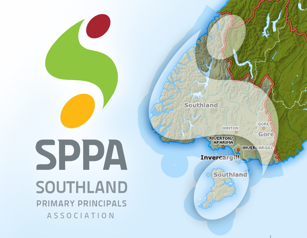
They are a proud association. To emphasize this I designed the logo in the shape of an ‘S’ for Southland. The symbol is a stylized representation of the Southland Region. The logos shape is like a pathway - alluding to the association's reach to every principal throughout the region. It is comprised of three colors - Burgundy and Yellow (their regional colors) and Green (symbolizing the land).

Logo Overlay on the Southland Region
I enjoy creating mottos, taglines and catch phrases. The motto that I came up with for SPPA was “Taking Care of Learning”. It describes the association’s collegial support, training, advocacy, influence, and connection with the regions principals and their schools.

Southland Primary Principals Association (SPPA) Logo
The finished logo is modern, bold and professional looking and packed with meaning!
Interested in other school logo examples?
Follow the link HERE to the "School Logos" page where there are close to 50 logos from schools around New Zealand and some from Australia. I regularly update this page with new examples as they come to hand.

SPPA's logo has stood the test of time.
Would you like a new logo for your educational organisation that not only looks good but is packed full of meaning? Please contact me and I'll talk you through the process.
Share this case study.


Takes a lot of talent and hard work to design, well done.
Thanks 🙂