School Branding Matters is a global school branding business. I want to inspire the education world with effective visual branding solutions that not only look amazing and are meaningful but, above all, support the aspirations of the schools they represent. Working internationally has never been easier. Let's go!
Below are some examples of the types of projects that I have worked on. Read about my thought process and how that impacts the look of the final designs.
Jurien Bay District High School - Australia
Jurien Bay District High School (Jurien Bay DHS) is a friendly and welcoming school located in Jurien Bay, Western Australia. It's a beautiful beachside town attracting lots of tourists each year. The school has a Kindergarten and caters to students through to Year 12. It is an inclusive and progressive school with a positive outlook on the future.
Jurien Bay is known for its fishing industry that focused on fishing the Western Rock Lobster. It was the town’s most important industry for quite some time. Now it is primarily a coastal holiday location for tourists - known for its beautiful farmland and bush, not to mention, its wonderful turquoise coloured ocean and golden sandy beach.

The Logo Design
The new logo has a number of ideas incorporated into its design. The Western Rock Lobster is used here as a metaphor for the life and actions of the JBDHS student. It has been stylised to look friendly and is shown moving in a forward direction. Some of the aspects of the Western Rock Lobster applied to the Jurien Bay DHS student here include:
- They are one of the most valued single species of fishery in Australia - Jurien Bay DHS students are precious and the future of the country.
- They have a hard upper shell and soft underbelly. This symbolises the correct balance between the inner and outer qualities of Jurien Bay DHS students. Outer strength combined with the right inner qualities determining their actions.
- They have antennae. These symbolise students' ability to make right decisions around what lies in front of them.
- The legs symbolise the learning tools available to Jurien Bay DHS students in helping them take the correct actions around those judgments.
- The legs and antennae that can regenerate - symbolising the resilient nature of students to be able to withstand whatever challenges are thrown at them.
There are three bands of colour. The blue and red tie in with the school’s existing colours while the yellow is an accent colour that ties in with the surrounding countryside and golden sandy beach. The waves tie in with the ocean but also represent progression through the school from a junior, to intermediate to a senior level student.
The shape of the symbol is based on a stylised rock. The young Western Rock Lobster develops near the coastline and then migrates into deeper waters when it matures. In the same way Jurien Bay DHS students develop their understanding within the safety of the school until they reach the end of Year 12 and are ready to face the next stage in their learning journey. The shape is three sided to tie in with the three school values - Respect, Responsibility and Commitment. These help guide their decision making during their time at school.


School Growth - USA
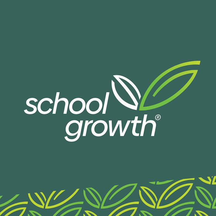
School Growth is an organization that helps schools thrive. They believe that by increasing the organizational and economic health of a school its educators will also thrive and, in doing so, will change the lives of students and transform communities.

The Logo Design
The new logo design is a symbolic representation of growth. When we think of growth, combined with green, we think of plant life or some other organic material. The logo symbol is based on the initials of the name in the form of leaves. The ‘S’ is the smaller leaf in dark green while the ‘G’ is the larger leaf in light green. The dark green represents established schools. The light green ‘G’ symbolizes growth and health of the school once School Growth becomes involved. They provide the right ‘nutrients’ in order for schools to thrive.
The symbol has an energy about it - a sense of moving in the right direction which is what School Growth helps schools achieve. This energy/movement is accentuated by the graduated color change in the light green. The logo symbol is also loosely based on a check mark shape. The typeface is smart, professional looking and in lowercase to give it a more friendly feel.


Future Business Leaders of America - USA
FBLA helps students prepare for careers in business and is one of the largest organizations of its kind in the USA. The projects included a new crest design (incorporating their new logo) and a conference theme graphic for 2022/23.
The Crest and Conference Graphic Designs
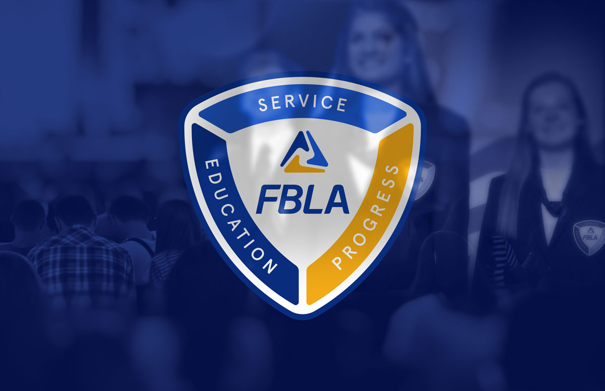
The new crest is a very balanced and harmonious design, where all the elements work together to support the FBLA logo at the center. Sometimes the simplest of solutions is the best.
The new crest incorporates stylistic aspects of the FBLA logo. These include the soft curved edges and an inverted triangle that forms the shape of the crest. This balances the upright Delta shape of the logo symbol. FBLA’s ideals of Service, Education and Progress surround the new logo symbolizing the supportive nature of the organization toward their student members.
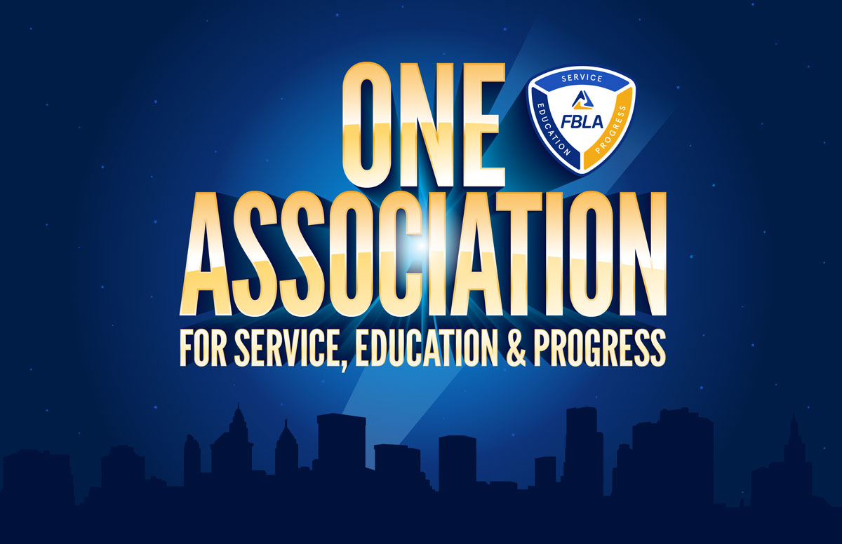
The conference theme adopted for the 2022/23 year was 'One Association for Service, Education & Progress'. This was used to reaffirm FBLA's primary goals as an organization towards students. The graphic incorporates a generic cityscape, the theme glowing in the night sky with a spotlight on the crest.


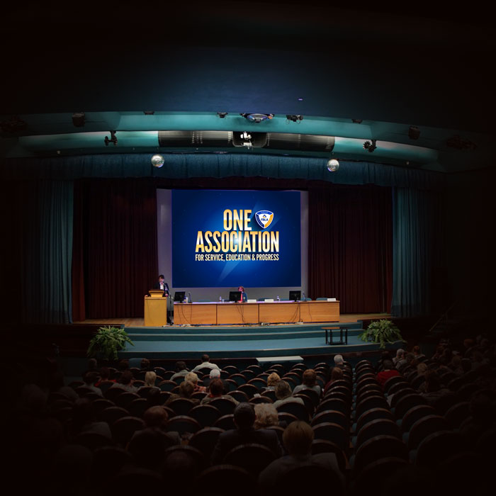
The conference theme adopted for the 2022/23 year was 'One Association for Service, Education & Progress'. This was used to reaffirm FBLA's primary goals as an organization towards students. The graphic incorporates a generic cityscape and the theme glowing in the night sky with a spotlight on the crest.
If you like what you've seen and read then get in touch. I will talk you through the process, what a typical branding proposal looks like as well as pricing information and deliverables once the project is approved. The process is very transparent.

I would love to work with you.
Contact me if you would like to know more information.

