By Craig Burton
September 14, 2023Wesley Intermediate School undertook an exciting new rebrand with an emphasis on reflecting their school community in a modern and progressive way. It was the perfect opportunity to do so given there was a complete rebuild of the school on the horizon. The resulting logo, values branding and brand identity will serve them well in their new facilities.

About the School
Te Kura Waenga o Wēteri | Wesley Intermediate has a heart for its community - a community rich in culture and in a location that creates some truly resilient students full of stories and creativity to share. The school is loved by those who have attended over the years. They have fond memories of amazing teachers and the many cultural, academic and sporting opportunities they had during their time at the school.
The te reo Māori name, Te Kura Waenga o Wēteri, is commonly used for Wesley Intermediate. The school is located very close to Te Auaunga, Oakley Creek, which is an important awa in the area. A lot of work is being done to bring the stream back to full health so that life can flourish in and alongside the stream for many years to come.
The school roll is largely Māori and Pasifika and there are a number of students from different parts of the world including places like Syria and Afganistan.
The New School Logo
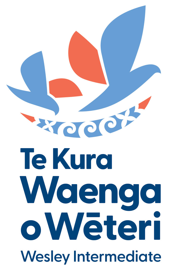
The logo design is focused on the awa - Te Auaunga - which is represented by the blue swoosh at the base of the symbol. This has three koru which represent the three school values - Whanaungatanga (Belonging), Hiranga ki mua (Excellence) and Rangatiratanga (Leadership). These underpin the school's beliefs around learning that help prepare students for their journey ahead.
On both sides of the koru are two frangipani. These are well known Pasifika symbols and used here to represent the welcoming nature of the school. Te Kura Waenga o Wēteri | Wesley Intermediate supports a large Pasifika community. The swoosh shape also resembles a river waka and alludes to the idea of students, of many cultures, being in the waka and moving forward together.
Above the awa are two birds representing Year 7 and 8 students. The Year 7 bird is slightly smaller and shown entering the school and drinking/feeding from the awa. The Year 8 bird is slightly larger and shown soaring over the awa, having satified its thirst and hunger, and feeling refreshed, revitalised and ready to move on to the next part of its journey.
Intermediates are transitional places and, like migratory birds, students find their way to the school. They are there for a 'season', find their needs met, and then move on.

School Values
Whanaungatanga
Belonging

Three birds shown supporting each other around a nest. The koru on the nest represent care, nurture and a sense of belonging.
Students are precious (taonga) and the school is a kind, caring, respectful and inclusive environment for them to thrive. Everyone feels a sense of belonging to the school.
Hiranga ki mua
Excellence

Three birds soaring high above the earth symbolising personal and school excellence. Below is a koru shape symbolising the river. It provides them with a reference point on the map that they recognise and can return to.
Students aim for high standards of themselves and support others in doing so too.
Rangatiratanga
Leadership

Three birds shown flying out of clouds and into clear sky. They are leaders together. Below is the land with a koiri pattern symbolising self reflection, nurture and flourishing as a result of a self determination to succeed.
Students want to be in the right place doing their best at all times.
Brand Pattern

School Logo Presentation
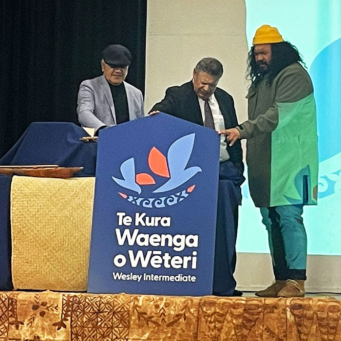
The logo was presented to the community in a special ceremony. Here are a few images from that amazing day.


About Intermediate School Branding
Intermediate schools are special places on the New Zealand School landscape. I have had the privilege of working with many over the years. These include:
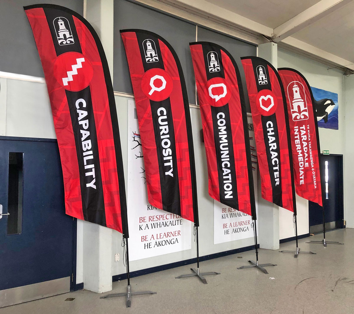
- Taradale Intermediate (read more here)
- Casebrook Intermediate
- Feilding Intermediate (read more here)
- Breens Intermediate
- Broadgreen Intermediate
- Cobham Intermediate
Check out the case studies linked above and look at some of the Intermediate School logo examples on my Logo Portfolio Page here.
Examples of PB4L / Values Branding can be found here.
From The Principal

"We are really impressed with the work that Craig has done. He listened to our situation and delivered a logo we are very proud of. Our community love the story behind the logo.
Craig has been professional, responsive and his understanding of schools is evident in his processes. We have had fantastic feedback about our new logo and refreshed look. Thanks Craig for such a streamlined process and for understanding us!"
Rachel Ward-McCarten (Principal)
Te Kura Waenga o Wēteri | Wesley Intermediate, Auckland

Interested in a school rebrand?
I'd love to work with you on creating an unique new image for your school. Check out some of the recent projects below and get in touch if you'd like to explore this further.

