By Craig Burton
January 10, 2023Pareawa Banks Avenue School was hit hard by the Christchurch earthquake on February 22nd, 2011. It was damaged beyond repair. Eleven years on and the school has begun the next phase of its education journey in brand new buildings. The new school looks amazing!
What did their branding journey look like and what was the thought process behind their logo design, signage, window manifestations and other branding assets?
How Did The School Logo Evolve?
Up until 2021 Pareawa Banks Avenue School was known as Banks Avenue School. Their first school logo was a student design based on the school vision - 'Living and Learning with HEART'.
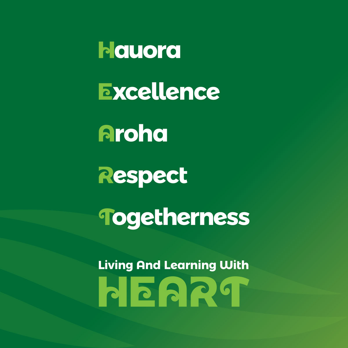
In 2017 I was asked to refresh the logo but not change it too much. Staff and students loved the overall look and what it stood for. I revised the shape, colour and included five additional koru to represent their five 'HEART' values - Hauora, Excellence, Aroha, Respect and Togetherness.


In 2020 Banks Avenue was gifted a new cultural narrative and Māori name. ‘Pareawa’ which means ‘adorning the banks of the river’.
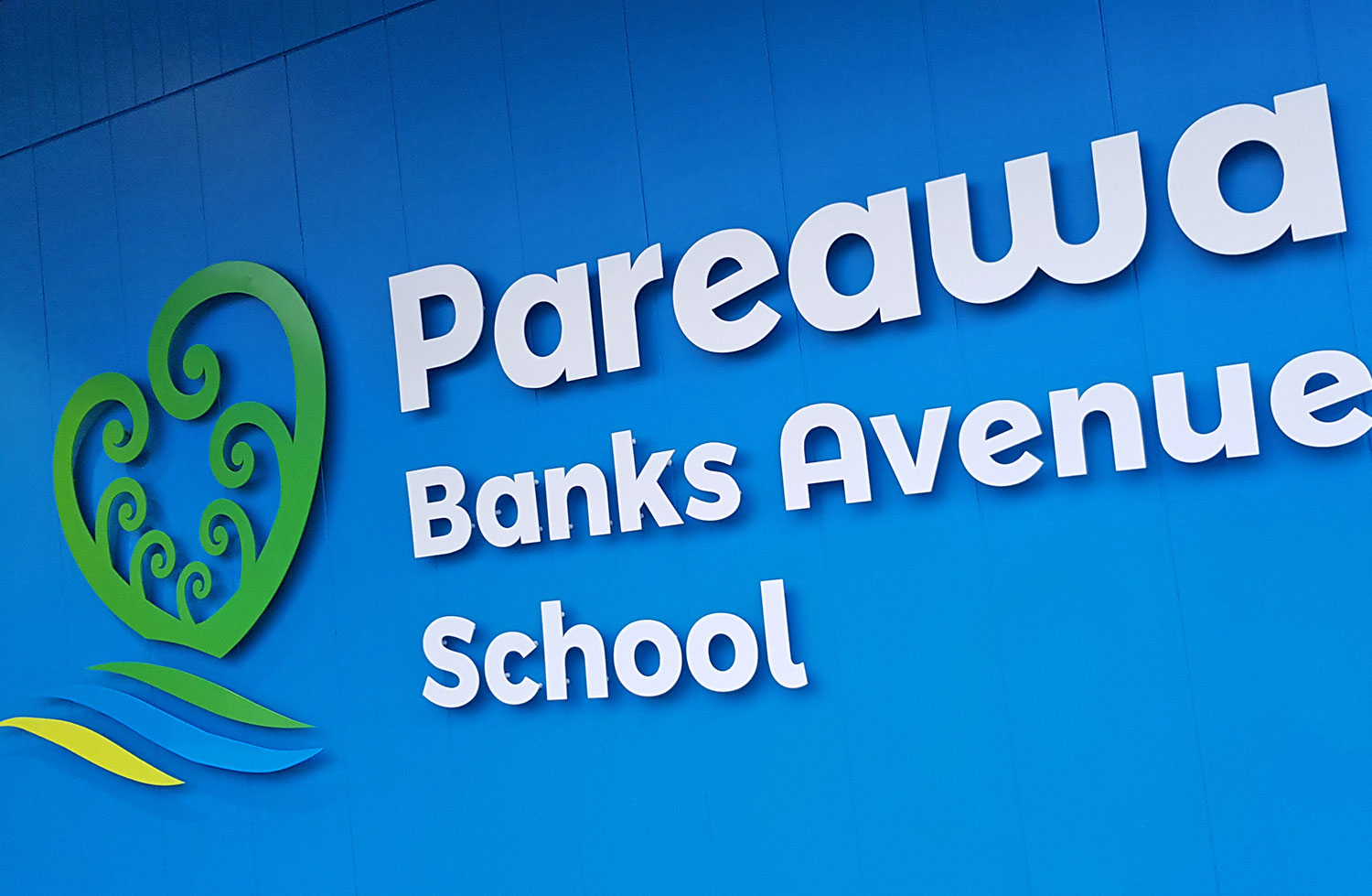
Given this, and the first sods of soil having been turned on the new school build, it was time to update the logo again to incorporate this additional meaning. The river and its banks were important symbolic additions to school story.
The static heart shape of the previous logo was changed to look more organic and plant like. It became a symbol of the native flora adorning the banks of the Ōtākaro river. This in turn acted as a metaphor for the adornment of mātauranga (knowledge) that the learner receives at Pareawa Banks Avenue School.

The two larger koru refer to the caring and nurturing relationship staff have with students and their families. The five small koru refer to the five ‘HEART’ values that support this relationship.
There are three wave shapes. The darker green shape represents the river bank. It symbolises the connection the school has to the new school site. The heart is shown just below the surface - its roots firmly in place. The blue shape represents the river as the source of knowledge and sustenance. The Ōtākaro river flows near the school. The light green shape symbolises the bank on the other side of the river. It references the past - honouring what has gone before.
Often school logos are overcomplicated designs - packed with too many ideas. Or they're very cold and corporate looking - lacking any connection with the special character of the school they're representing. I wanted this logo to capture the friendly nature of Pareawa Banks Avenue School. These types of characteristics are often the most difficult to capture the essence of.

The 'HEART' Values
Pareawa Banks Avenue School's 'HEART' Values are at the core of school life and learning.
HEART is an acronym for:
- Haoura
- Excellence
- Aroha
- Respect
- Togetherness
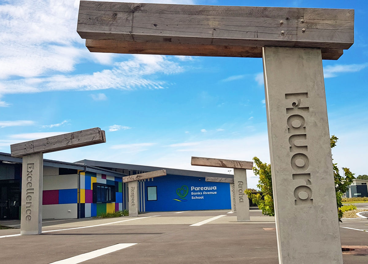
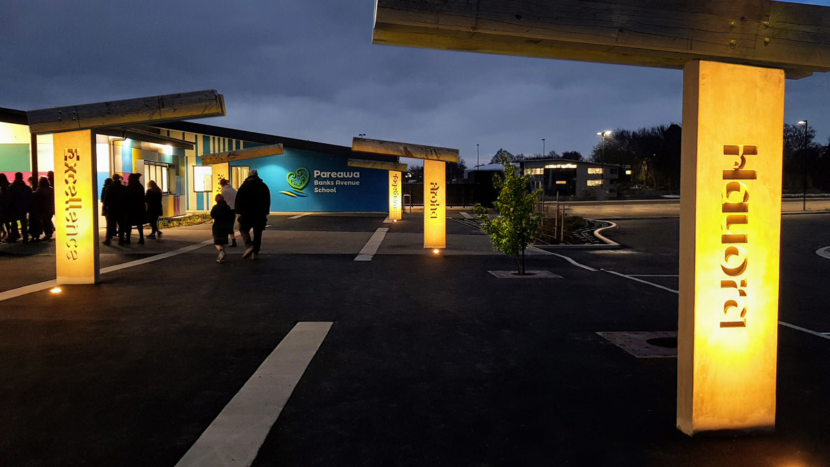
Logos were created for each of them and promoted everywhere. No more so than when entering the new school where visitors walk past the five Values Pillars.
The New School Entrance
The architect created an amazing space and it was nice to be included in the conversation around how the branding would look on the concrete entrance sign and pillars. My role was the create the artwork for these areas.
Spotlights on each of the values pillars add atmosphere to the space as vistors and students walk through the area.
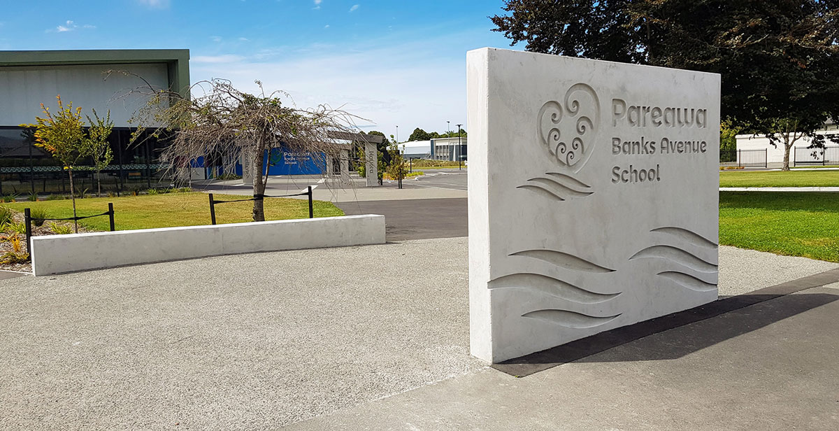

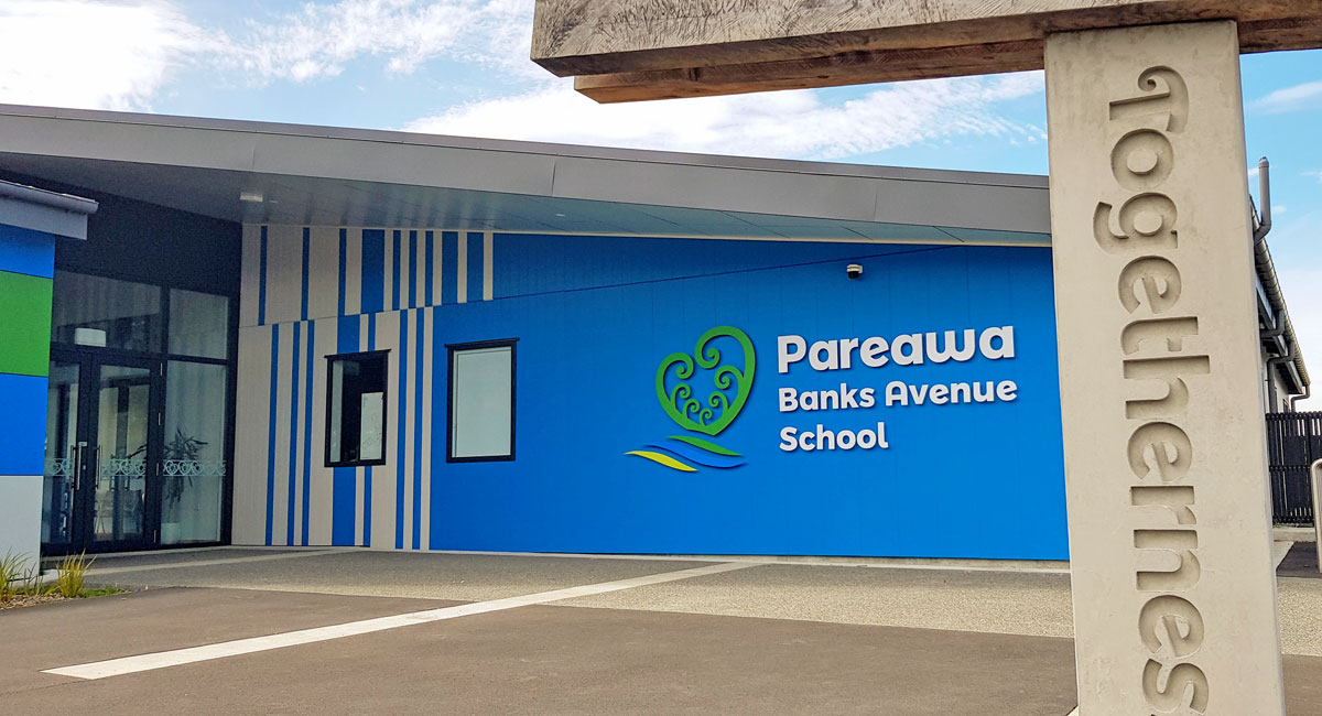
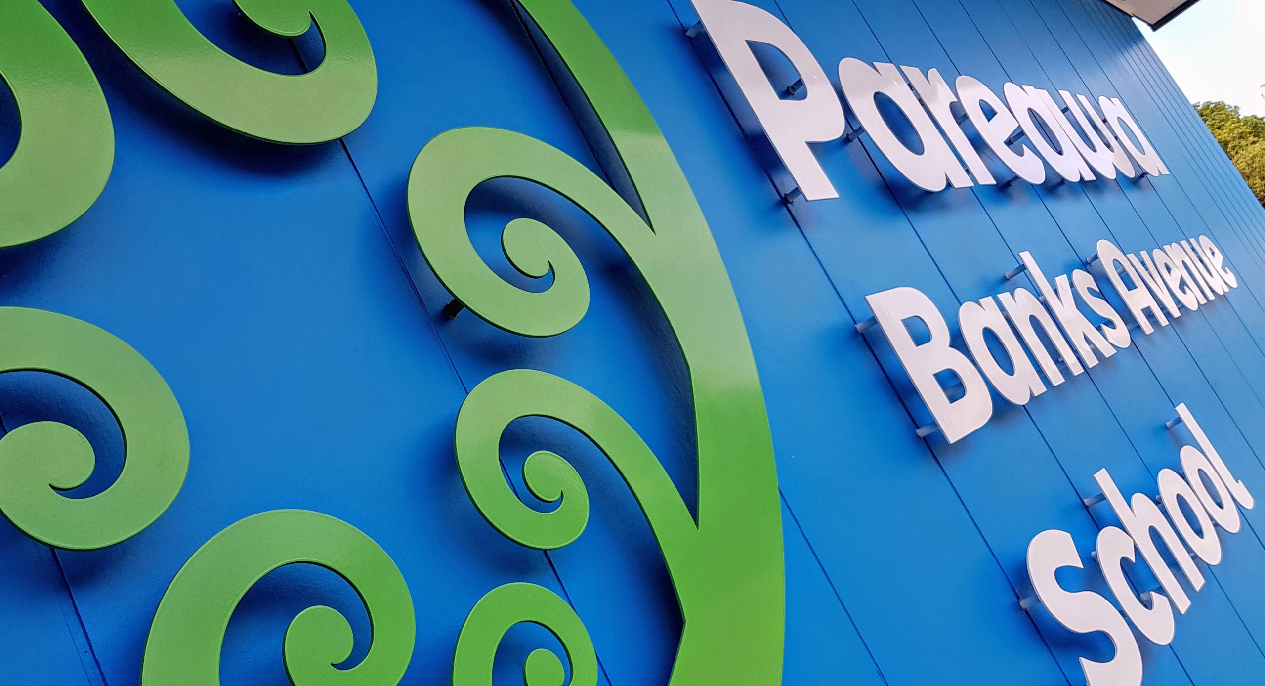
The school logo on the building is made from ACM Board - an aluminium composite material. This is a popular and relatively inexpensive way to add signage around the school.
Window Manifestations
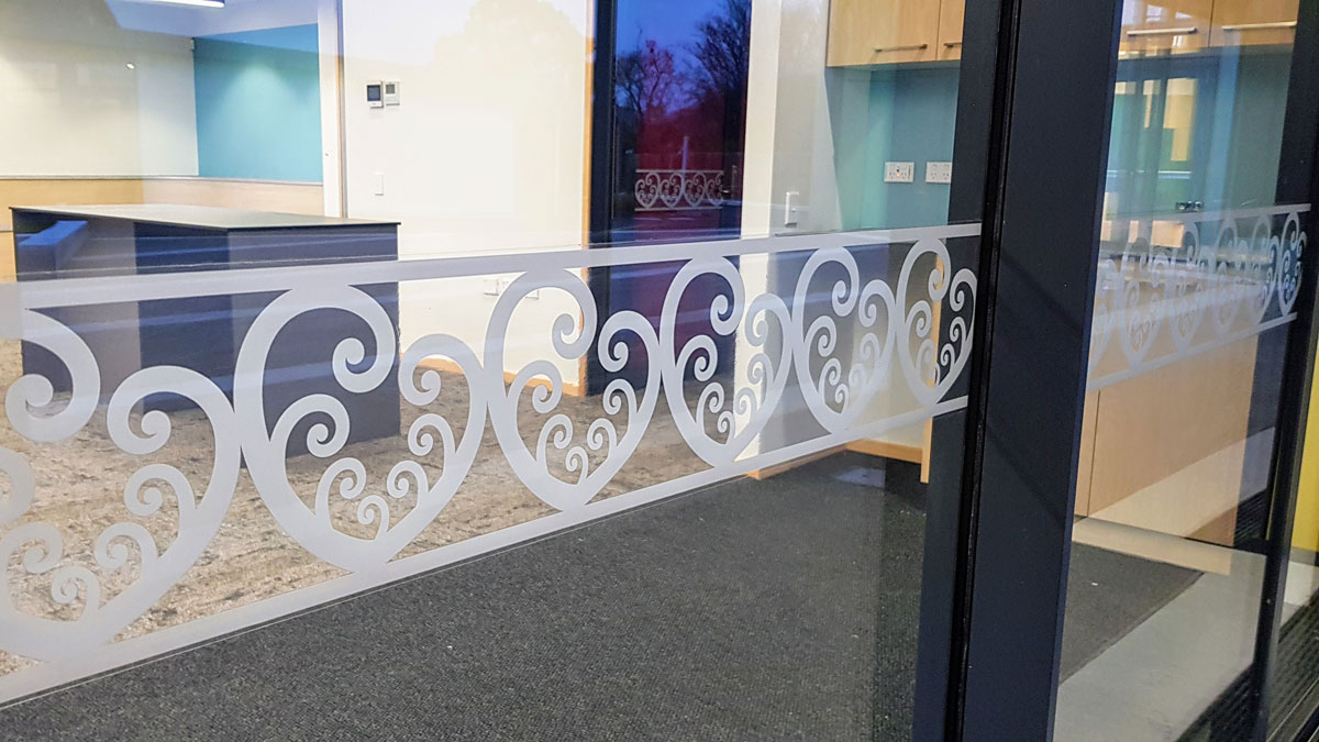
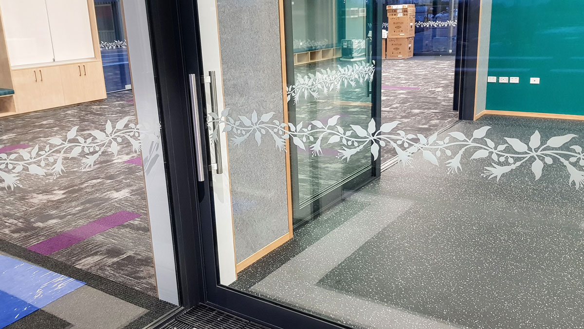
Each of the buildings were given names based on native plants that would have flourished in the area. I created window manifestations to tie in with the building names. These are repetitive patterns to allow for long or short spaces. For areas not named a generic pattern was created based on the school logo symbol.
Generic Pattern

Manakura Pattern

Kotukutuku Pattern

Poataniwha Pattern

Kiwakiwa Pattern


From the Principal - Toni Burnside

"Working with School Branding Matters has been a treat. As a PB4L school our values are integral to showing who we are and what we value. After our first meeting with Craig it was obvious he had listened to us and had picked up the journey we have been on and how we wanted to be portrayed. We were thrilled with the visual representations he shared with us and the different options he provided to us. We would thoroughly recommend School Branding Matters to other schools. Thank you Craig for showing us some 'HEART'"
Toni Burnside
Principal - Pareawa Banks Avenue School

New school build or rebuild?
It pays to begin the branding process early so that any signage and window manifestations can be allowed and planned for. Let me know if I can help with any questions you might have around this.

