Window Innovation’s Commercial Branding Success

By Craig Burton
March 31, 2017Even though I specialise in school branding I still receive a number of enquiries from companies requiring commercial branding help. It's a different type of challenge to that of schools. I hope by showcasing some of these projects here that it provides a little bit of an insight into the 25 years of experience that I bring to the school branding world.
This is one such project that I completed for a new company called Window Innovation Ltd. In 2018 they received the Window Association of New Zealand "Window Manufacturer's Showroom of the Year" Award. I feel honoured to have had the opportunity to work on their brand.
This is their story.
Toward the end of 2016, while schools in New Zealand were preparing to close for the summer break over Christmas, I was approached by one of the directors of Window Innovation Limited - a new company that specialises in the design and manufacture of aluminium joinery for architecturally designed homes.
I took this project on because it looked like an exciting challenge. So I sat down with the directors and we talked about the company, their dreams for it, the types of customers they were interested in attracting, and the type of image they wanted to project.
Their branding requirements included:
-
Logo Design
-
Style Guidelines
-
Stationery Collateral
-
Vehicle Branding
-
Building Signage
-
Street Signage
-
Website
The logo was the first branding componant to be addressed. They wanted a company logo that was slightly abstract, friendly, modern, and would appeal to both the middle and upper end of the market. So I put my thinking cap on.

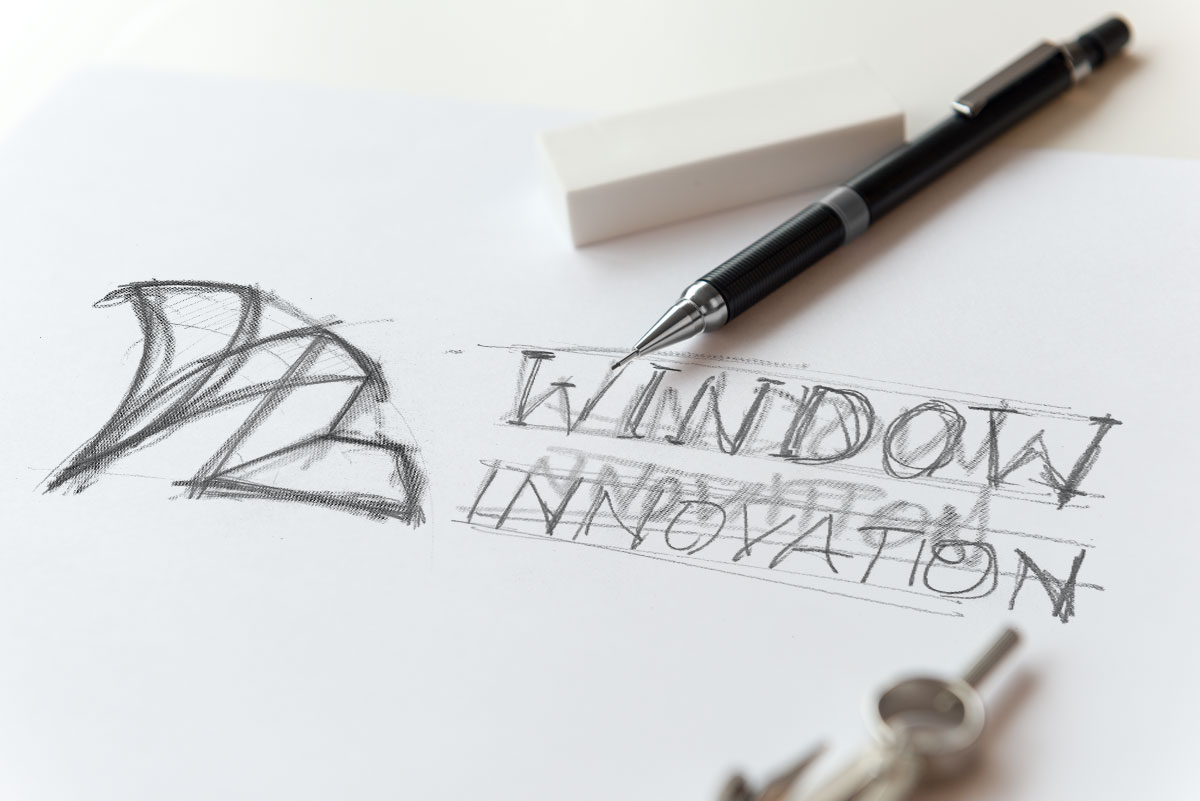
Original Logo Concept Sketch
Like all of the logos I design it begins with sketching some ideas until I find something that I feel has potential to explore further. Then I scan it onto my computer and work it up in Illustrator. At this stage of the process I begin to explore the shape, proportions, and colour in more detail until I'm satisfied that the logo ticks all of the right boxes for my client.
What Does Their Logo Mean?

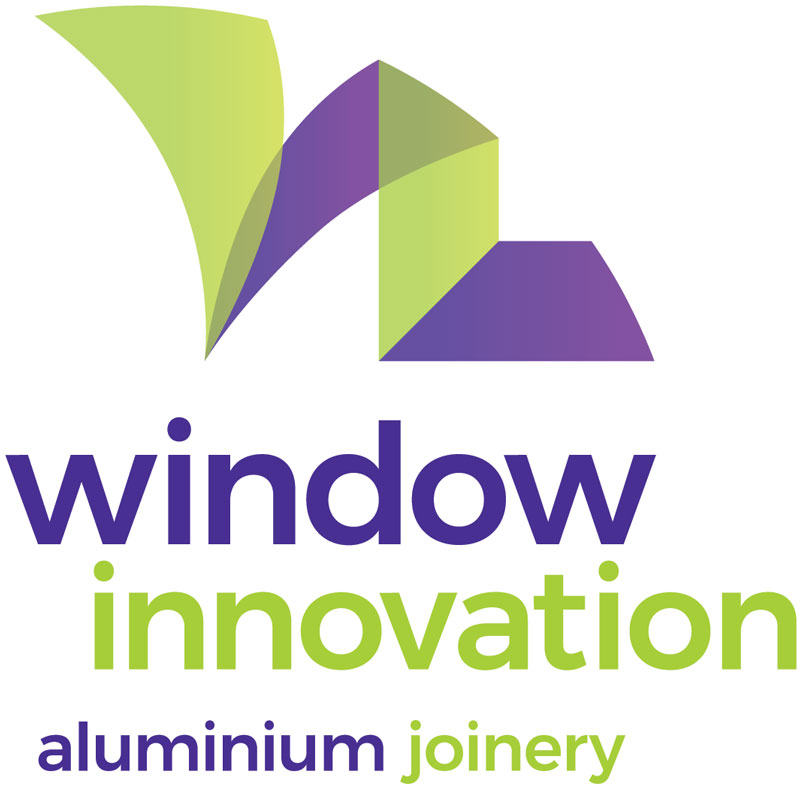
The logo design is based on a stylised “W” which stands for “Window”. The first two parts of the “W” shape represent innovation, input, design, thought, manufacture, processing, personalisation, customisation, service (the ‘doing’ part). The second two parts of the “W” represent the corner of an alumium window frame (the product).
As a whole the logo design conveys energy, innovation, is modern, and friendly. The first two shapes have a translucent feel about them implying glass (the glass is placed into the alumium frame).
It has an origami feel about it. Just as origami is the "art of paper folding", Window Innovation are leaders in the "art of designing and manufacturing aluminium joinery" for architecturally designed homes.

Stationery - Business Cards, Letterhead, Notepad
Showroom Exterior (Before and After)

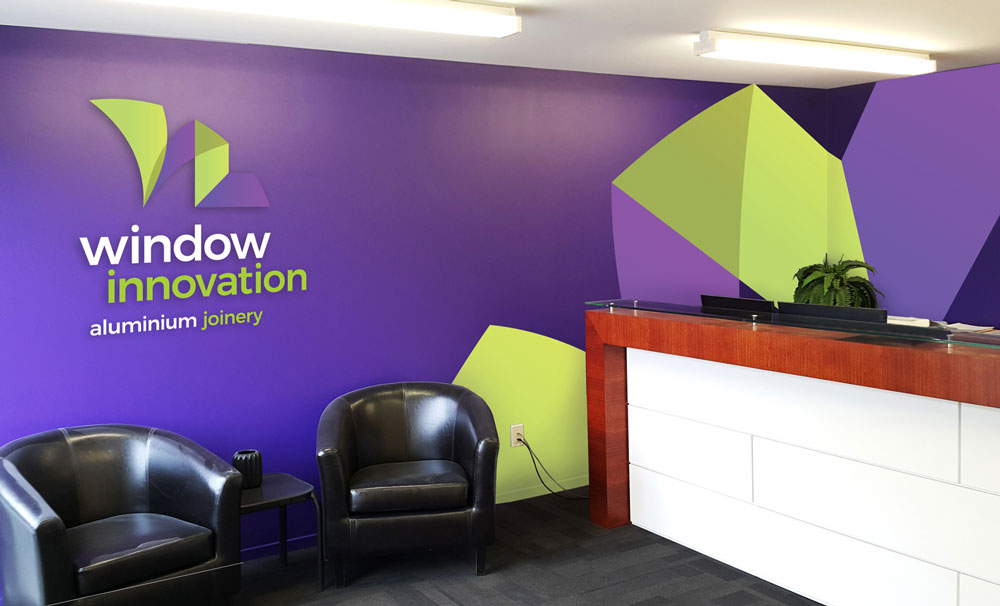
Showroom Interior Design

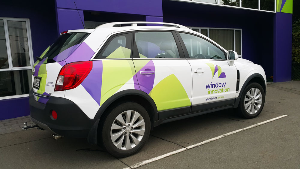
Car, Truck, and Van Signage
Check out the Irrigate Solutions Case Study if you would like to view another example of a commercial branding project I've worked on.

Does your company have a strong visual presence in the market?
Feel free to contact me if you would like to know more about how I could help your company develop a strong brand image.


