South Otago High School’s PB4L Branding

By Craig Burton
June 8, 2018South Otago High School approached me to create some branding around their PB4L Values. They have three core values - Respect, Excellence and Pride. How could these be personalised for South Otago High School's current situation? What visual elements could be drawn upon to give these values a sense of place and purpose?
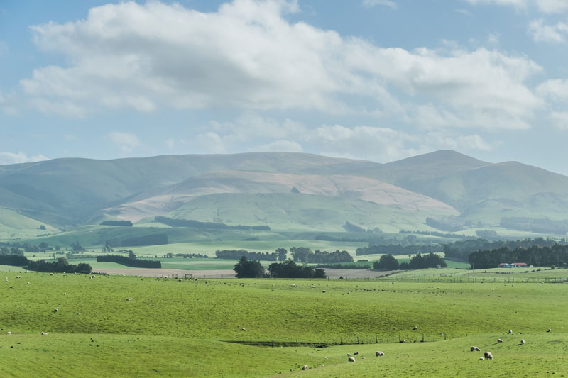
The school was initially a little reluctant to include any geographically significant elements in their new PB4L logo and branding. Balclutha is a small rural town with a population of only 4000. The iconic Balclutha Bridge, for example, was already used as a logo by a local primary school. However, I felt that the bridge along with two other important features about the place could be adopted, in a new way, to create something that was unique to South Otago High School.
Not only that, this branding was for a High School as opposed to a Primary School. These were two very different schools with very different student audiences. The combination of elements would mean there could be no confusion around their brands looking similar.
PB4L Logo Design Process
The new PB4L logo is comprised of three elements that represent geographically significant features associated with the region. These are the Balclutha Bridge, the Clutha River and the surrounding countryside.
I took these elements and created individual symbols for each of the three values. While working away I wanted to also make sure that any new values icons could also be combined to form the PB4L logo representing all three values at once. Consideration also needed to be given to how they would be used. For example, the school was wanting to produce small badges for each of the values. This meant that they needed to be kept simple for production reasons.

RESPECT - WHAKAUTE
This is represented by the Clutha River. It is the second largest river in New Zealand and the largest in the South Island. There are two hydroelectric power stations along the Clutha River. It is a source of energy and life to the region. In the same way South Otago High School students are contributing members of the school. They demonstrate RESPECT/WHAKAUTE by respecting themselves, fellow students and the environment in their words and deeds every day.

EXCELLENCE - HIRANGA
This is represented by the Balclutha Bridge. South Otago High School's motto is "Fide et Fortitudine" (By Faith and Fortitude). Excellence in this context has to do with strength of character and doing ones best at all times.
The Balclutha bridge is a great example of EXCELLENCE/HIRANGA in terms of its quality and engineering.

PERSEVERANCE - TE MANAWANUI
This is represented by the Land. Balclutha is a fertile farming region. Farmers work the land with PERSEVERANCE/TE MANAWANUI, reaping the rewards for their efforts. In the same way, students work hard to achieve excellence in all aspects of their lives.

PB4L VALUES LOGO
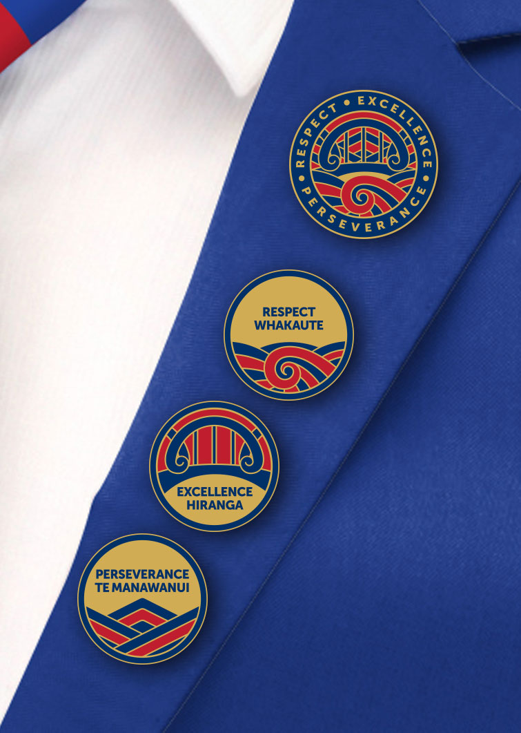
The individual icons for each value were then combined to create the school's PB4L Logo. This helps capture the essence of the programme in one place. The individual values icons are an "unbundling" of this logo to help promote and celebrate pro-social behaviour around individual values.
It is a smart looking logo solution. The koru shapes in the water and bridge add a nice Māori feel to the design. The addition of gold to the existing blue and red school colours alludes to the quality of the education that parents can expect to recieve for their children when they become students at the school.
PB4L VALUES BADGES & SCHOOL LOGO CONCEPT
Gold badges were made to celebrate and reward those students who were acting as positive role models by demonstrating the values at school. They are fantastic mementos of their time at South Otago High.
It was during this time that I wondered how it might look if the PB4L Values Logo were to be used as the school logo. I felt that it embodied the school attributes and motto perfectly so mocked it up on the school blazer.

School Logo Concept
I also mocked the new logo up on the side of one of their new school buildings (as shown below). It was eventually painted on to the wall.


PB4L Values Branding for High Schools has a different set of requirements to those of Primary Schools. In both cases they are linked back to a school's identity but in different ways that are visually appealing to the respective age group of the students.
PB4L branding is an extension of a school's overall brand identity where the behavioural expectations are branded to work in with the school's existing brand and not apart from it - even enhancing it. My experience has found that the process helps school leaders think more clearly about their overall school brand. The Burnside High School PB4L Branding Case Study is another example of how this is acheived.

PB4L Values Branding works!
Feel free to contact me if you would like to know more about the process of creating some branding for your PB4L programme.


