Feilding Intermediate’s New School Logo

By Craig Burton
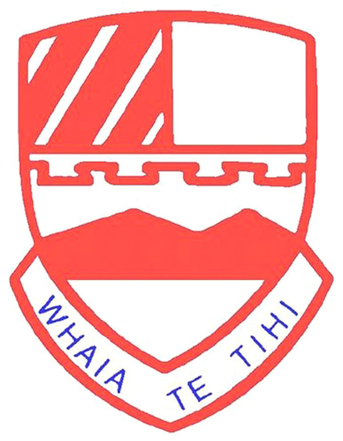
July 9, 2018Feilding Intermediate has a new school logo. Their previous logo had a mountain in a crest. They wanted to retain the crest shape and their motto "Aiming for the Top". But Feilding is a very flat town. How could the new logo look, so that it captured the essence of their motto, without alluding to mountains?
Old School Logo

The previous school logo was very tired looking. Staff and students had no idea what it stood for other than the mountains related to the motto. They didn't have any high quality versions of the logo on file and it was being used inconsistently.
Feilding Intermediate was changing. New ideas and a new curriculum were being introduced. There was an urgency around having a logo created to reflect this fresh path they were on.
New School Logo

I put my thinking cap on and, after numerous sketch concepts, came up with the idea of basing the new logo on an arrow head. It alluded to the motto but without the use of mountains.
Intermediate Schools are unique in that they only cater for Year 7 and 8 students. The large red and blue overlapping arrow heads are representative of these two year groups. The blue arrow head symbolises Year 7 students - lower in height. The larger red arrow head symbolises Year 8 students - in their second year and therefore higher in height.
Together they form the letter “F” for "Feilding" turned on its side.
The four smaller blue, green, yellow and red arrow heads represent the four school houses. Students are placed into a house when they commence the school. The coloured arrows also symbolise the student learning pathway at either Year 7 or Year 8 level.
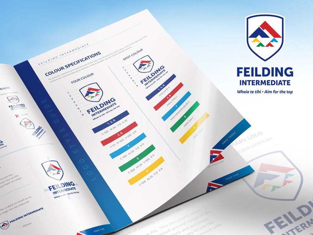
A Style Guide was created to help protect the integrity of the logo when being used by staff and suppliers. An internal letterhead and business cards were also created.

Feilding Intermediate Logo Style Guide
From Diane Crate, Principal at Fielding Intermediate

"We approached Craig to modernise our very dated logo - but we had almost no ideas for what it could look like. We also wanted to revise our uniform, so this placed considerable time pressure for a new logo! Craig was able to talk us through the design process and created a logo that suited our needs perfectly. He was able to incorporate elements of our traditional logo, as well as take into consideration the special features of our school. Our community is thrilled with the new logo! Craig has continued to be helpful with business cards, letterheads and any other items we need. "
Diane Crate
Principal, Feilding Intermediate, New Zealand

I love creating logos for schools
If you would like to know more about the process of creating one for your school feel free to contact me.


